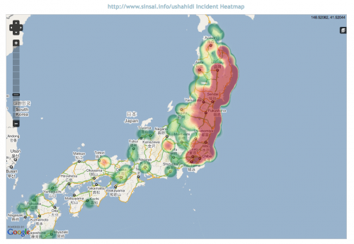
We're trying to come up with other ways of visualizing Ushahidi data. Using the Ushahidi API, Emmanuel whipped up a heatmap of the Japan deployment (http://sinsai.info/ushahidi).
You can see it live here: http://demo.ushahidi.com/japan. On the live map, you can toggle the clustered numbers on/off using the "stack" button on the right side of the map.
[caption id="attachment_3757" align="alignnone" width="500" caption="Japan earthquake Ushahidi data, heatmapped"] [/caption]
We're thinking of doing two things to make this more useful:
 [/caption]
We're thinking of doing two things to make this more useful:
- Making it filterable by category.
- Creating it as a plugin so that anyone can put it on their own Ushahidi deployment.