(Post written by Jepchumba, Designer at Ushahidi and Founder of the African Digital Art Network)
As a team, Ushahidi made the conscious decision to redirect its approach to building its core services and products. We collectively declared that design must be involved from the beginning to the end of every lifecycle of everything we launched. Design when stripped bare is the art of communication. Being in the business of crowd source data across the globe there are many challenges constructing an application that will intuitively serve in a diverse range of uses cases, across cultures and varying degrees of accessibility to technology.
In response to these challenges 3.0 begun by asking the right questions to users who have seen Ushahidi’s powerful ability to serve people around the world. Our community of stakeholders, influential people in the Ushahidi and crowdsourcing communities and users of the platform from deployers, contributors and reporters, had the opportunity to participate in thinking about our approach to design.
Gabriel White, Designer and User Interface expert at Small Surfaces, summarized his findings. The big ask from the community was to ensure that the new platform would allow for alternative forms of representing data outside the framework of mapping. In order to better serve the crowd it was important to think about how best to redesign our own understanding of data.
The process of designing 3.0 has been quite arduous because we’ve had to think about how our ability to visually perceive and interpret data is largely affected by cultural dynamics. Redesigning 3.0 has been a process in not only defining what Ushahidi’s visual culture will be in the future but also defining how we can take complex sources of information and make them digestible to our users.
 Here are some of the core questions and issues of redesigning 3.0 that we have come across:
 Here are some of the core questions and issues of redesigning 3.0 that we have come across:
- Language : We as a team have been in the process of thinking about how we can create a new language in understanding crowd source data. We have had debates on our own use of language - for example should we stick to terms such as reporting and reporters? How can we translate, not only linguistically, the power of our platform and power of the crowd?
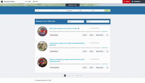
- Layout : The orientation and layout of our platform bridges the gap between functionality and the users. We have had to think about the placement of some of the core functionality. What takes prescedence? How do we allow for alternative layouts for those who might not be interested in mapping but would like to see data visualized alternatively.
- Navigation : How can we make the new platform easy to use and quickly access alternative forms of information.
- Symbols, Color, and Metaphors - Symbols such as icons, metaphors are powerful but will they translate across cultures and degree of exposure to technology and devices. What icons and colors holistically represent the functionalities and features we hope to launch in the future?
- Visualization - One of the most key features of 3.0 will be its ability to include alternative forms of data including images, videos and multimedia. How will be able to incorporate these within our platform?
Ushahidi was born out of crisis, but now as a 5 year old company we are exploring how to best redesign our platform to ensure that we can cater to a global context by extending the design space with improved functionality and workflow. We are quickly moving from being reactionary to how data is processed and consumed to actually redefining how data will be designed in the crowd.