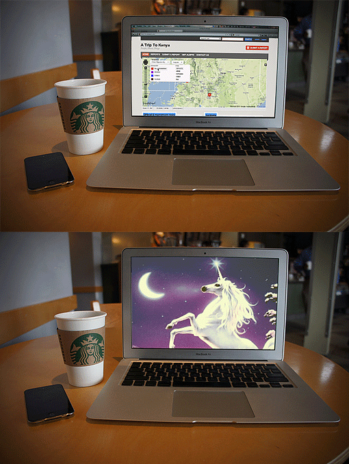
During the month of September, we’re releasing one theme a week for the Ushahidi platform. This is second theme to be released.


Meet "Unicorn" <- because we can ;)
The default Ushahidi theme has the classic two column layout with the map on the left and the categories on the right. With Unicorn, we decided to change things up a bit and give the map the full width of the page. It’s clean, simple and gives you a fresh-looking layout for your next deployment! Our favorite part of the theme is how the map filters have been reworked on the home page. We've put them in an easily accessible drop-down menu, allowing the map to come front and center:The Technical Nitty Gritty
Much like the previous theme we released, Unicorn implemented with relatively few changes to the core files.- Lines of CSS: ~250
- Number of Images Used: 3
- Files Changed: header.php, footer.php, main.php