Over the last few days, we have been rewriting the section of the platform that deals with the map + timeline on the main page. While on the refactoring rampage, a few neurons went off and implanted some thoughts which I’d like to share. However, before indulging you with those, here is a primer of the changes:
- The main map is totally decoupled from the timeline. In effect, this means you can turn the timeline display on/off without having to serve a cocktail of CSS hacks - as is currently the case. Also, the timeline is “pluggable”, which is to say that you can swap out the default timeline with your own. At the moment, we're using the jqplot library (http://www.jqplot.com) for the timeline.
- This next one is special: the main map now supports events (which is to say, when x takes place on the map, perform y). When the report filters are changed, the timeline is updated. Example: a user filters the reports on the main map by category, media type (news, photos, video), date range (using the slider)
For the coders:
You can register a callback function to be executed when an event is triggered. Taking the report filters example above, we have a `refreshTimeline` function in views/main_js which is subscribed to the 'filterschanged' event. The latter is triggered each time the report filters are modified - passing the updated filters to its subscribers - `refreshTimeline` in this case - as a parameter.
Use cases for using the map as a gateway for interacting with an external application/system
Exploring the events concept within the map, here are a few use cases:
- Sensors: For those in the Internet of Things space, say you are using the map to display the devices that are being monitored (a la Cosm). You can tweak/extend the events system so that by clicking on the device’s marker (eg. a red dot) it sends a command to the device (e.g. pull information from the device and display it on the map). We would be very interested in the applications you come up with or envision for this.
- Parameters: Tracking the parameters used to filter the content shown on the main map. For “slow burn” (where a deployment is running over a long period of time) deployments, this data may give useful insights on what people are interested in vis-à-vis what is being reported and how user patterns have changed over the lifetime of the deployment. Consider the sinsai.info deployment data (Tōhoku earthquake and tsunami 2011). What if Hal Seki and his team would have been in a position to better analyze and determine which filter parameters were most used? How would that have informed the UX design of the deployment?
- Paid deployments: If you have a business model around your deployment e.g. crowdsourcing restaurant menus, you could offer to notify the restaurants on record (for a fee) about the most popular menus base of date/time of the week/month/year
- And just for kicks, replenish your cat's milk supply when....
We look forward to you testing out these ideas and code. At Ushahidi, we’ve learned that letting code into the ether for deployers to use and remix means constant innovation and surprises. We can wait to see what you create.
You can check out this code on our
develop branch on GitHub. We shall merge it into
master once it is fully tested.
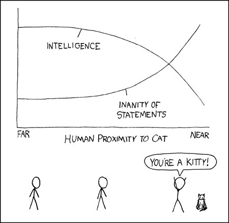
The featured image by xkcd is licensed under CC BY-NC 2.5
 Over the last few days, we have been rewriting the section of the platform that deals with the map + timeline on the main page. While on the refactoring rampage, a few neurons went off and implanted some thoughts which I’d like to share. However, before indulging you with those, here is a primer of the changes: