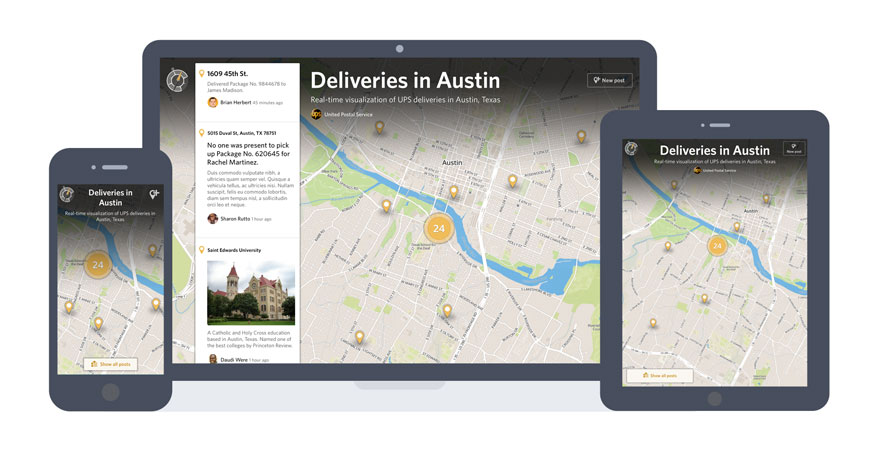
I’m not proud of this, but some of our original design concepts for Crowdmap didn’t include maps. Crazy, right? Sure, there were pathways to view a map as, you know, a map. But it wasn’t the first thing you saw.
Thankfully, we fixed that well before launch. But I’ve refused to bury that memory because, within that mistake, was a key insight: On Crowdmap, maps are everything. And we’re doubling down on that insight in our upcoming improvements to Crowdmap.com.
On the website today, all of the content for a map rests on top of an interactive web map. But that map isn’t even interactive until you select “Expand map.” It’s secondary. Maps aren’t everything.
We’ve worked hard to fix that over the past six months, taking a very aggressive approach to making maps the focus of your experience -- so aggressive that, when visiting a map, there’s nothing else in your browser window.
The presentation of your maps starts with a full-screen interactive web map, with three items layered over it:
- The name and description of their map.
- A small timeline that displays the rich content associated with each map marker.
- A button to ‘add a post’ to the map.
These pieces of content all react to one another. If you pan, zoom or select the map, the map’s name and description tuck away, providing even more screen real estate for interaction. If you select a marker, the timeline highlights that marker’s rich post content. Likewise, if you select a post in the timeline, the map pans to and highlights to the corresponding marker.
We think it’s a pretty fluid experience. Have a look:
[embed]https://www.youtube.com/watch?v=NgudhM9SYDU[/embed]
Everything else -- from your account settings to Crowdmap search -- is tucked underneath the full-screen map. Selecting the Crowdmap compass at the top-left of the view exposes those underlying tools:
- Home: A summary of activity on maps you own, collaborate on or follow.
- Search: Find maps, posts or people anywhere on Crowdmap.
- Map settings: An editable summary of the settings for the map you’re currently visiting.
- Map collaborators: An editable summary of the people collaborating on the map you’re currently visiting.
- Account settings: An editable summary of the settings for your personal Crowdmap account.
You can see how it works to expose these tools (and return to the map) in the following video:
[embed]https://www.youtube.com/watch?v=S1Owiwr6PQc[/embed]
This approach is more than just a fresh coat of paint. It’s intended to solve three big problems:
- People don’t know what to do with or make of the information as it’s displayed today on a map.
- Maps aren’t portable.
- It’s difficult to assemble a team around the building of a map.
We’re targeting Problem No. 1 with our improvements to how maps prioritize their interactive map and timeline, bringing clarity to the story they’re telling.
Our decision to tuck away Crowdmap’s underlying tools is in the service of solving Problem No. 2, treating maps as portable objects that anyone can embed in whatever environment they can. When we consider the design of maps, we’re imagining them being used outside the context of Crowdmap.com -- embedded in articles or applied full-screen on an entirely different website. These are contexts where Crowdmap’s underlying tools are a distraction and potentially confusing.
Problem No. 3, affecting teams, is at the heart of our ongoing effort to make the management of a map a team effort. Whether that team is the crowd or your co-workers, every map has the underlying tools to assemble a team that can moderate and edit its content.
While maps’ collaboration tools are visible in the previous screenshots and videos, I’ll be taking a deeper dive into them in a future blog post. Until then, we look forward to rolling out this improved experience on Crowdmap.com and hearing what you think of the changes.
 I’m not proud of this, but some of our original design concepts for Crowdmap didn’t include maps. Crazy, right? Sure, there were pathways to view a map as, you know, a map. But it wasn’t the first thing you saw.
Thankfully, we fixed that well before launch. But I’ve refused to bury that memory because, within that mistake, was a key insight: On Crowdmap, maps are everything. And we’re doubling down on that insight in our upcoming improvements to Crowdmap.com.
On the website today, all of the content for a map rests on top of an interactive web map. But that map isn’t even interactive until you select “Expand map.” It’s secondary. Maps aren’t everything.
We’ve worked hard to fix that over the past six months, taking a very aggressive approach to making maps the focus of your experience -- so aggressive that, when visiting a map, there’s nothing else in your browser window.
The presentation of your maps starts with a full-screen interactive web map, with three items layered over it: