It’s been a couple of weeks since our last v3 beta release, but there’s a whole lot of work that’s been happening in the background.
The V3 team has been working around the clock to ensure that we’re not only building a world class product, but a product that is user centered. The design and functionality need to be able to meet our users’ expectations.
The V3 user interface has gone through a major overhaul. Sophie, one of our senior designers, recently gave an account on designing for V3 and building out the pattern library. A lot of improvements have been to product architecture, user interface, workflows and terminology. However, we want to make sure that we’re keeping our users centered in the entire design and development process.
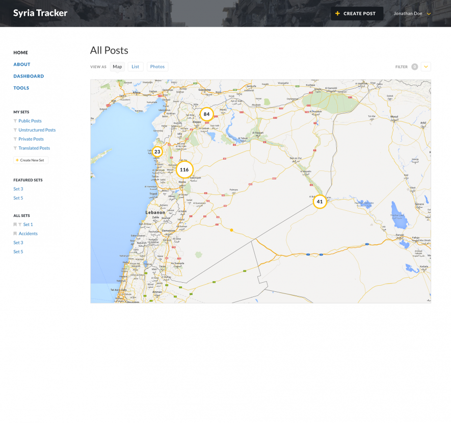
We recently conducted our first user experience study on designs from the pattern library work from the design team. This study was carried out over a week on a small group of users, the majority of whom had past experience using Ushahidi at varied levels. It was a smooth eye-opening process that involved getting feedback on the new designs from the different users. We held a series of Google hangouts/Skype calls and face to face interviews, where we displayed mockup designs and asked the users a series of questions along each page. For this first study, we tackled four different sections of the Ushahidi platform:-
[caption id="attachment_17043" align="alignnone" width="885"] Map View[/caption]
We needed to see if our designs were intuitive enough for users to navigate around the platform and sought to see if users could figure out :-
 Map View[/caption]
We needed to see if our designs were intuitive enough for users to navigate around the platform and sought to see if users could figure out :-
- how to create a post
- how to search
- how to move to the admin dashboard
- what the term “sets” means, among other questions
- username: demo
- password: testing