As Sharon outlined in her great post last week, we have completed our first round of user testing on Ushahidi V3. We tested key interactions on pages from the Pattern Library with users of varying levels of Ushahidi experience.
Poring through the results of user testing is one of my favorite things to do as a designer. It confirms and supports many of our design decisions, and reveals a to-do list of how we can improve the product. Win-win!
Here were the biggest points of confusion for users, and how we have solved them:
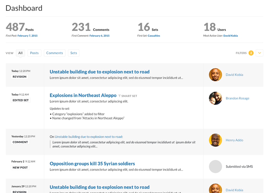 AFTER: We renamed the page "Activity" and hinted at the chronology of deployment activities by showing them on a timeline.
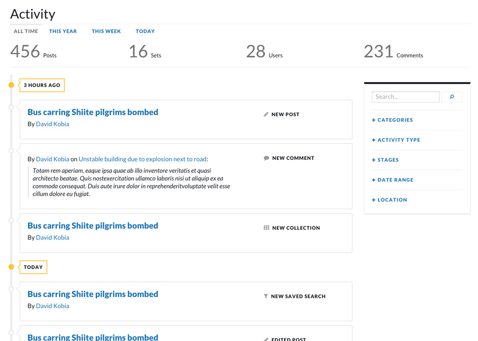
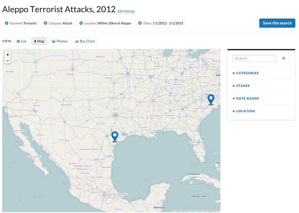
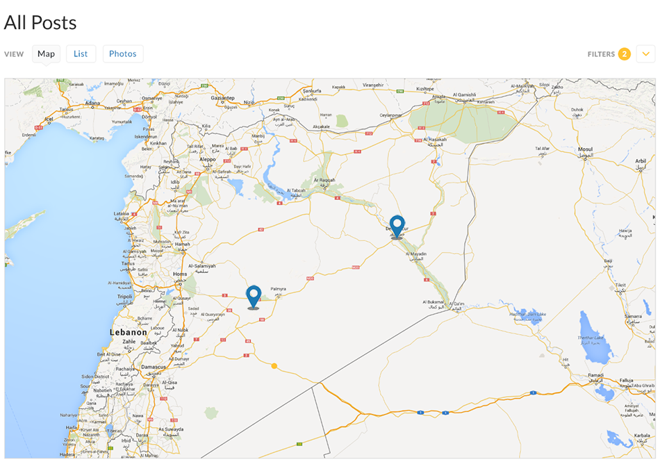 AFTER: We list each filter that has been applied, and have the list of filters shown by default.

“Sets” and “Smart Sets” are now “Collections” and “Saved Searches”
The name “Sets” confused almost all users, regardless of experience level. A set is a way of grouping and saving posts, either manually into a “set” or dynamically (by saving filtered categories, keywords, or other criteria) into a “smart set”. After months of using this vocabulary internally, it felt familiar and we assumed it would make as much sense to a user as it did to us. But when users heard the terms for the first time, the name didn't give them any hints of what the functionality would be. So we’ve decided to stop calling them by an ambiguous name and just call them what they are: “Collections” and “Saved Searches.” Additionally, we have rethought how they are displayed in the main menu. We think this is much clearer, and are looking forward to seeing if our next round of user testing confirms our hunch.The "Dashboard" is now “Activity”
The purpose of the Dashboard is to provide a reverse-chronological list of activity within the deployment. Unlike the post list view, which shows only posts, the dashboard covers all activity in a deployment: new comments, revisions, completed stages, etc. However, many users didn’t understand the difference between the dashboard and the list page. The first change we made to clear things up is to rename Dashboard into Activity, which explains the purpose of the page more clearly. We also iterated the design so that the items listed are more obviously in chronological order. Additionally, some users suggested that this page should show an overview of how activity has changed over time, so we added a stats counter at the top of the page, which can be changed by date. BEFORE: The title "Dashboard" did not tell users that the listing here was in chronological order, and they confused the design with the list view. AFTER: We renamed the page "Activity" and hinted at the chronology of deployment activities by showing them on a timeline.

Saved Searches & Filters
The act of applying filters to posts is an essential feature of the platform, and, unfortunately, we learned that we were falling short on providing users the easiest ways to do this. Users weren’t sure how to do keyword searches, nor was it clear which filters had already been applied to the posts they were seeing. We have rethought filters entirely. We changed the label to “Search & Filter” and have a keyword search front and center. When a user applies a filter or keyword search to the posts, they will be listed above, and a user will be able to either turn off the filter, or save them as a Saved Search. Also, many users mentioned that they wanted to always have the search & filters beside the map view, so we have updated the layout to make them always shown on larger screens. BEFORE: The filtered map did not provide enough visual cues to show users what filters had been applied. AFTER: We list each filter that has been applied, and have the list of filters shown by default.
