Ushahidi designers are effectively “free range” within its sprawling farm of product teams. Though many developers also contribute to more than one team, designers are fortunate to be intensely active on pretty much all of them.
Here’s a look at the harvest from the past two weeks.
Ping
Ping was born out of the anxious days following the Westgate Mall siege that rocked Nairobi in 2013. It’s a two-way, multi-channel alert and group check-in system that does one thing incredibly well: Help you get an answer to a critical question from the people you’re responsible for.
It helps you quickly send a message -- like “are you okay?” -- to all of your friends in a critical moment, and then easily see a summary of that group’s responses.
Like most Ushahidi software, it started as an
open public code repository, called “Ping,” that developers could use to assemble their own communication system. Today, it’s a hosted service with a full-time team that’s rallied to make it just as easy to get started using Ping as it is to send messages (or “pings”) with it.
The team
released an alpha version of the service in October and, after drafting revised wireframes in February, completed its first user experience study of the new product in March. The study highlighted some key problems, like users’ confusion with the interface for composing or responding to a ping.
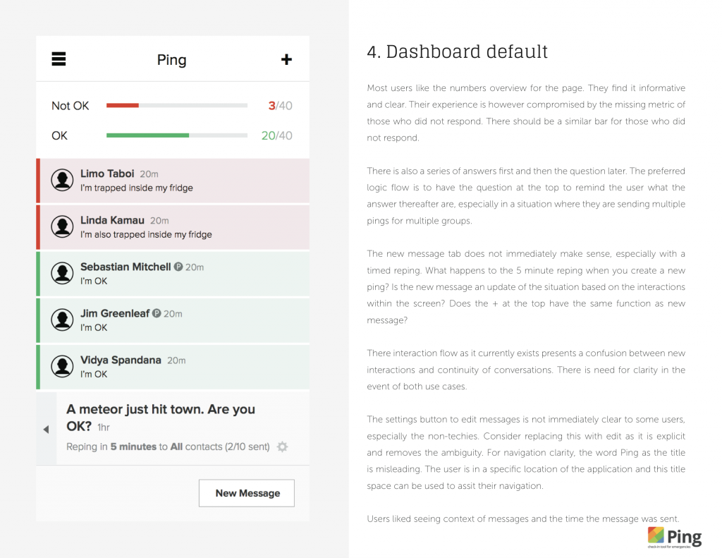
The team spent much of March polishing the user experience and developing a visual design system for the product’s iOS and web applications.
The result was a 31-page “UX Concept,” with an index of screen mockups, for each of the most important workflows.
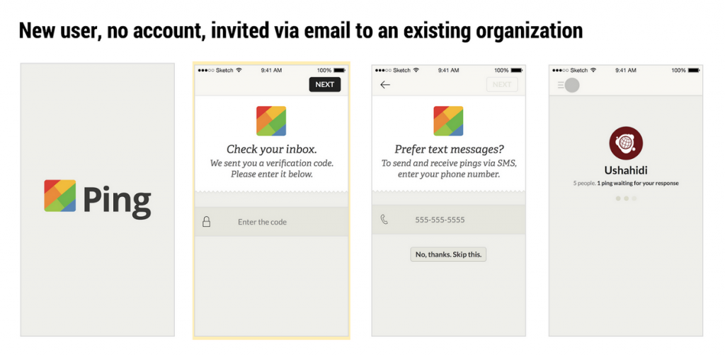
We were able to spell out, A., how the user could go about doing what they’d expect to do, and B., what exactly it would look like. Here, for example, is what a user might see if they simply opened the Ping iOS app to see their organization’s latest activity.
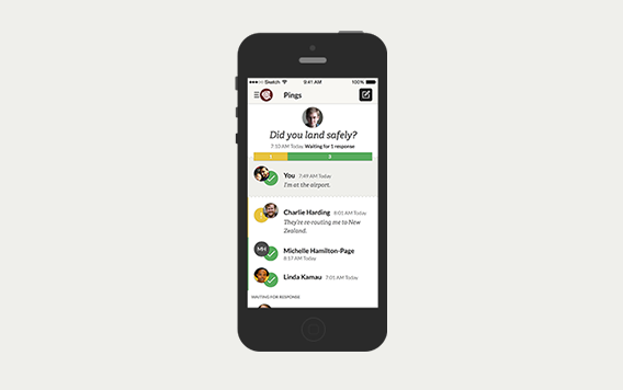
The iHub’s UX Lab is putting the revised design concept through a second user experience study next week. With those results, the team will then immediately begin designing Ping’s larger-screen web experience and develop the user interface for its iOS and web applications.
Ushahidi Platform web client
Ushahidi developer,
Seth Hall focused much of his work this month on
the front-end guidelines for the Ushahidi Platform web client’s
Pattern Library. These guidelines outline rules and best practices for writing consistent and maintainable code for multiple deployments, with multiple developers. The guidelines are intended to help anyone that’s looking to customize the look and feel of their Ushahidi Platform deployment by describing:
- How the code base is set up and structured.
- Each file's purpose.
- Any dependencies that need to be installed.
- How to build layouts using the Pattern Library’s grid system
- How breakpoints and media queries are used.
- How to produce clean, reusable code with Sass.
Seth expects to complete the guidelines by the end of the month.
In case you missed it, Ushahidi Quality Assurance Engineer
Sharon Rutto led
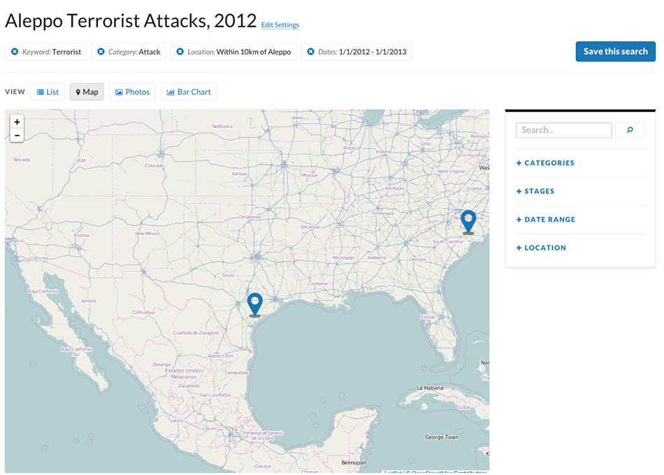
the first user experience study of the Ushahidi Platform’s web client in March, testing the utility of the language and layout used in the product.
Ushahidi Senior Designer
Sophie Shepherd then
wrote last week about what the design team learned from the study, and how it’s immediately changed the product.
 Ushahidi designers are effectively “free range” within its sprawling farm of product teams. Though many developers also contribute to more than one team, designers are fortunate to be intensely active on pretty much all of them.
Here’s a look at the harvest from the past two weeks.
 The team spent much of March polishing the user experience and developing a visual design system for the product’s iOS and web applications.
The result was a 31-page “UX Concept,” with an index of screen mockups, for each of the most important workflows.
 We were able to spell out, A., how the user could go about doing what they’d expect to do, and B., what exactly it would look like. Here, for example, is what a user might see if they simply opened the Ping iOS app to see their organization’s latest activity.
 The iHub’s UX Lab is putting the revised design concept through a second user experience study next week. With those results, the team will then immediately begin designing Ping’s larger-screen web experience and develop the user interface for its iOS and web applications.
 Ushahidi Senior Designer Sophie Shepherd then wrote last week about what the design team learned from the study, and how it’s immediately changed the product.